Nintendo Annual Report
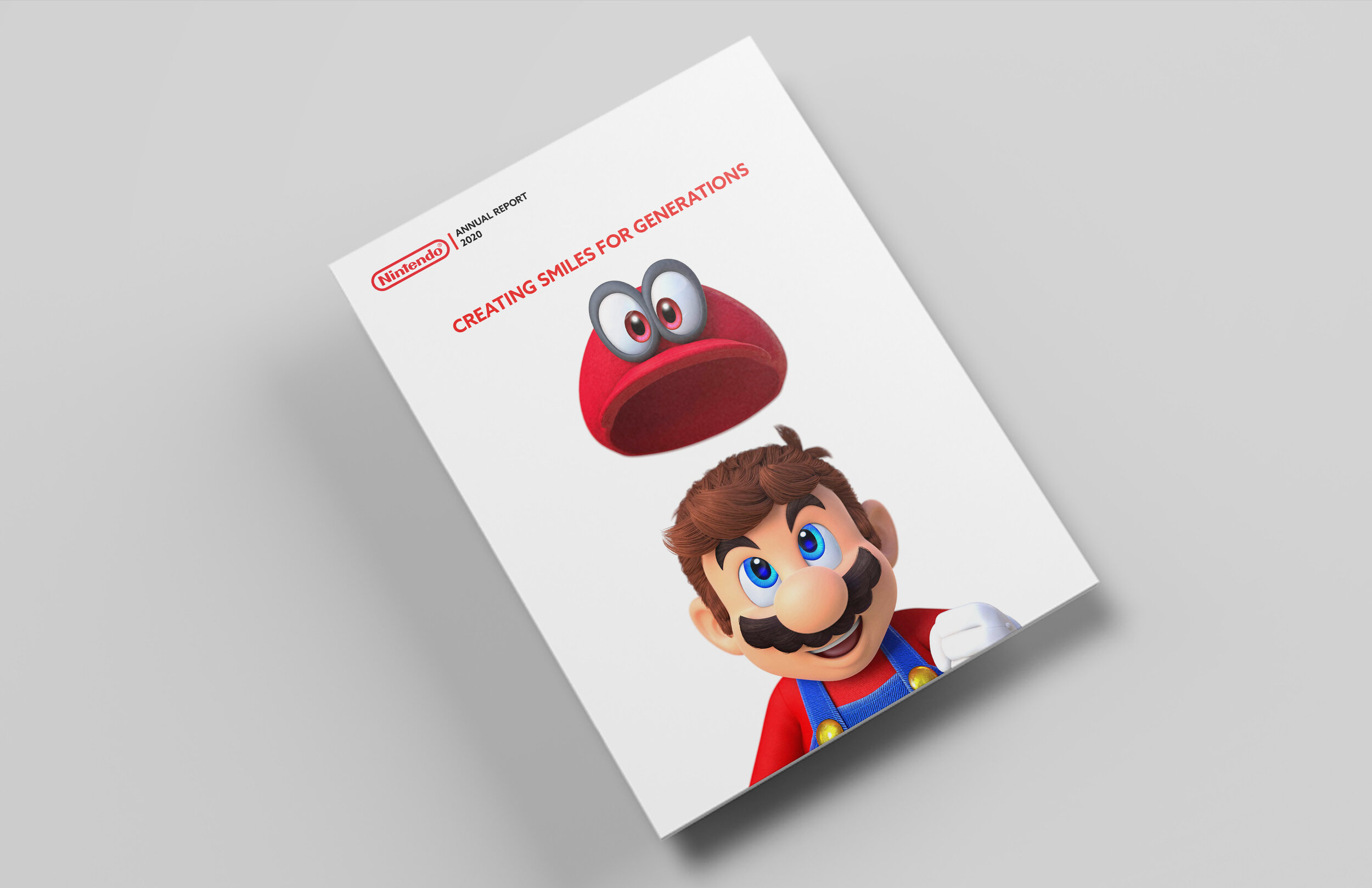
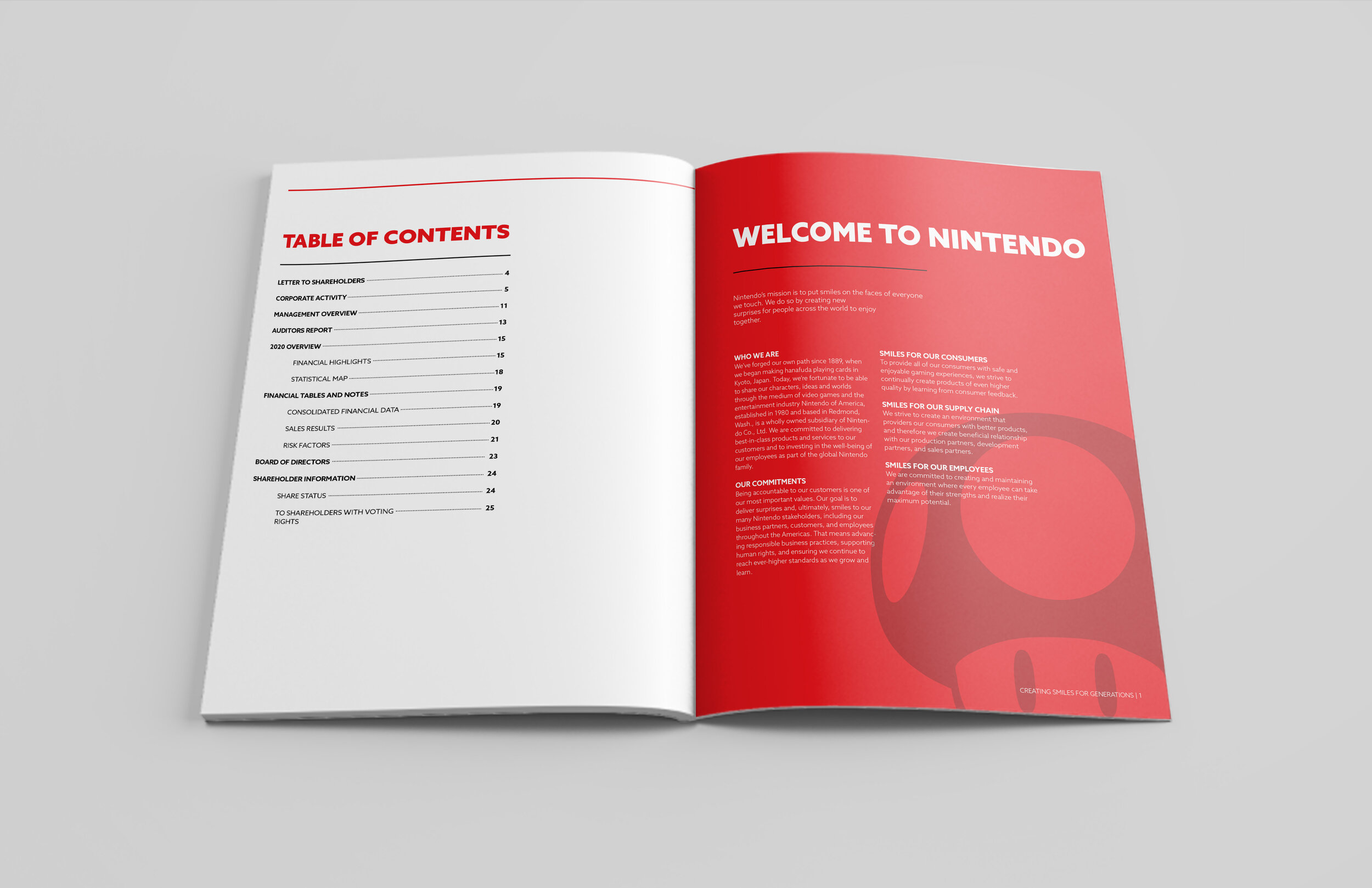
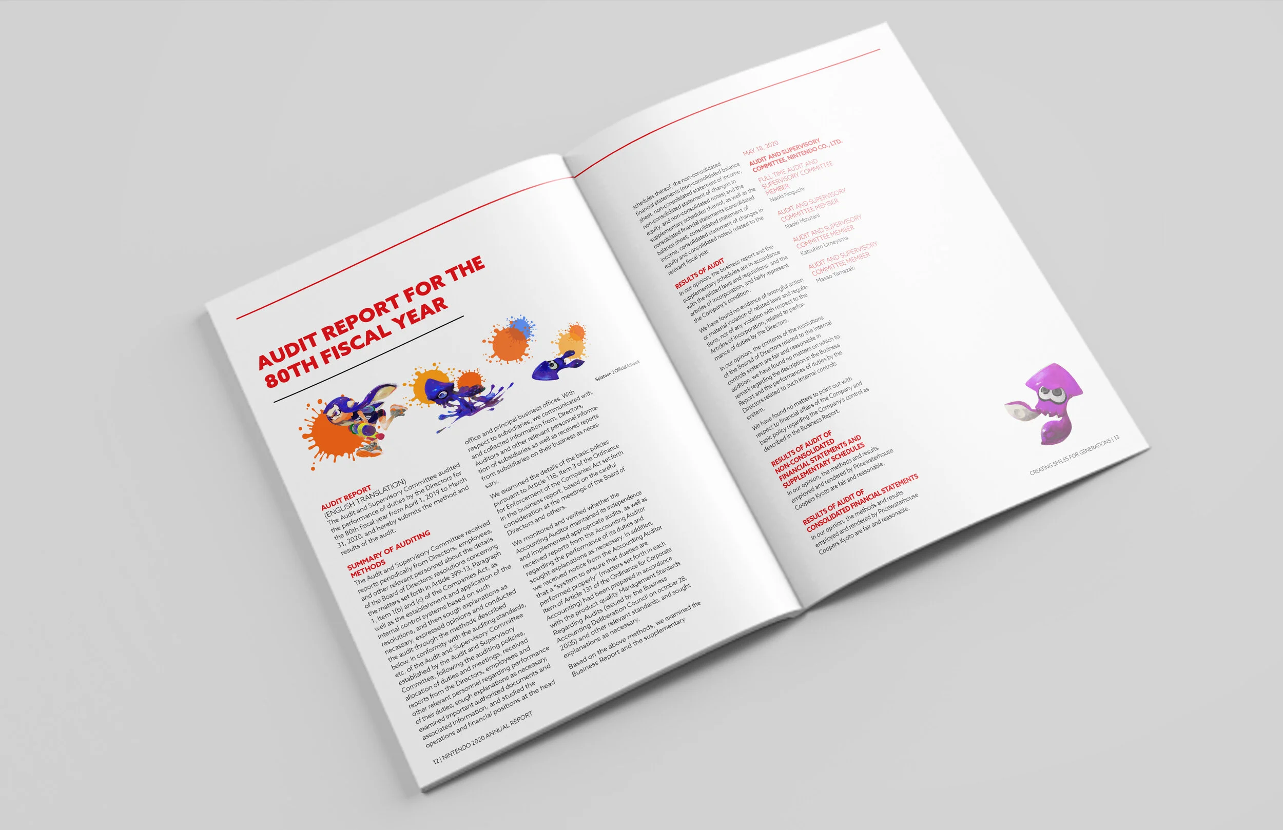
This student project involved redesigning Nintendo’s annual report as a way to explore publication and information design. The goal was to create a visual system that felt consistent with Nintendo’s existing brand while making the report easier to navigate and more engaging to read.
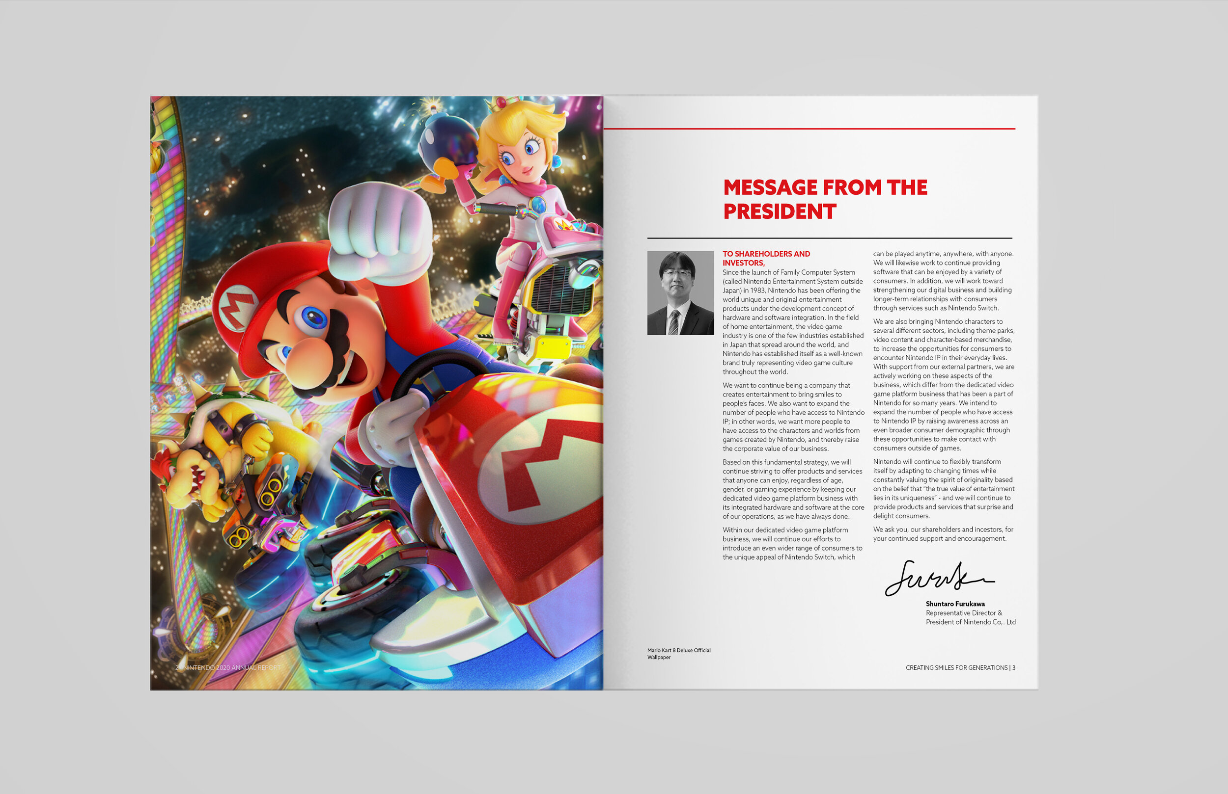
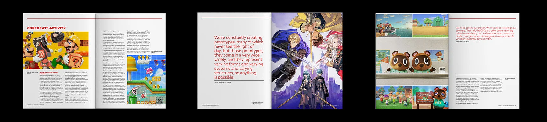
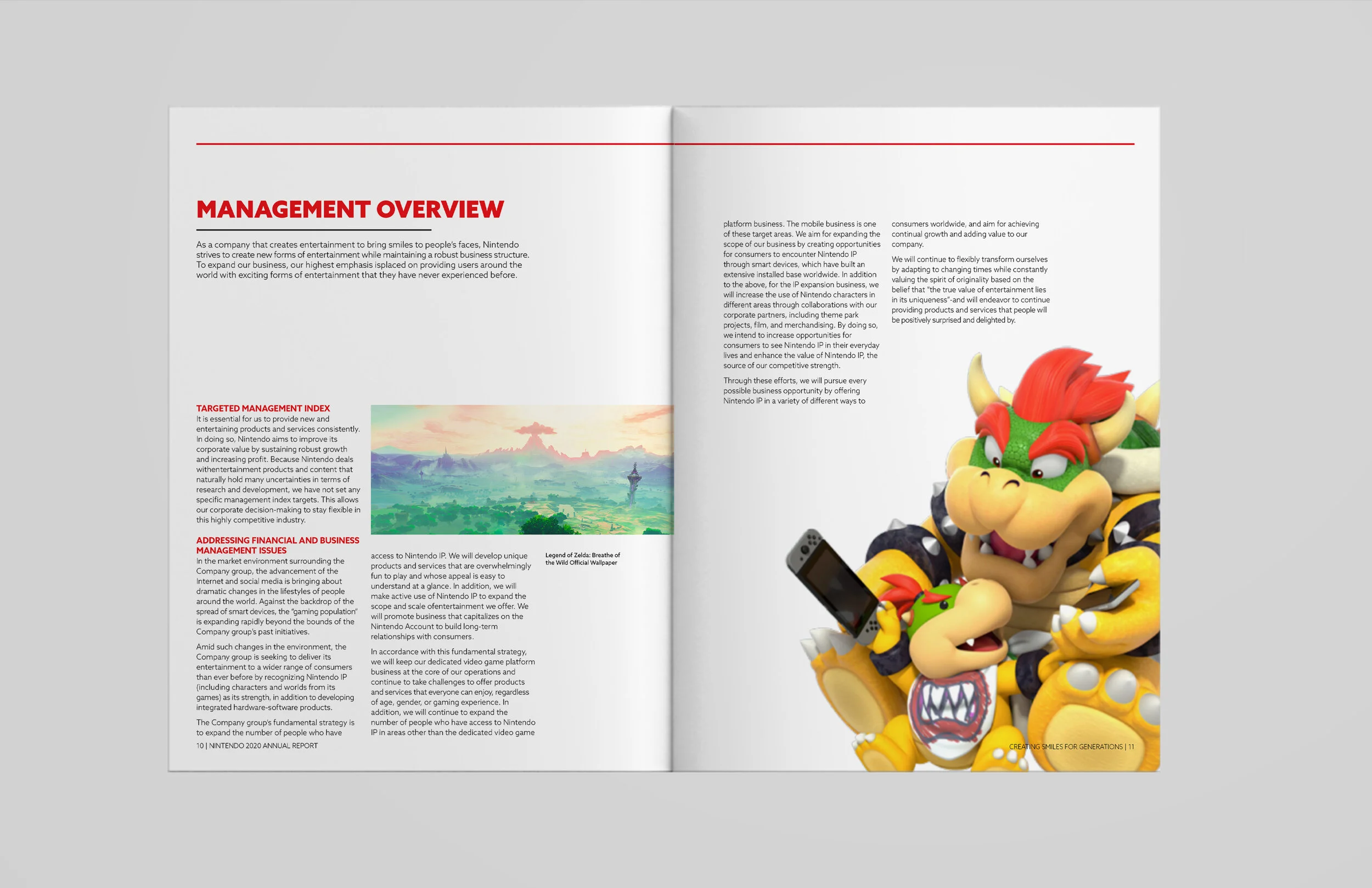
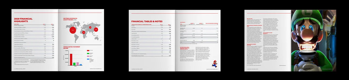
I focused on Nintendo’s recognizable characters and visual identity as key elements of the design. The report uses a simple, modern layout with Nintendo’s signature red as the primary colour, while character illustrations are incorporated throughout the publication and into infographics.
The design balances financial and corporate information with Nintendo’s playful brand, using colour, imagery, typography, and layout to create hierarchy and make dense information easier to navigate.
Role: Graphic Designer
Year: 2021
Programs used: InDesign, Photoshop, Illustrator