Planned Parenthood
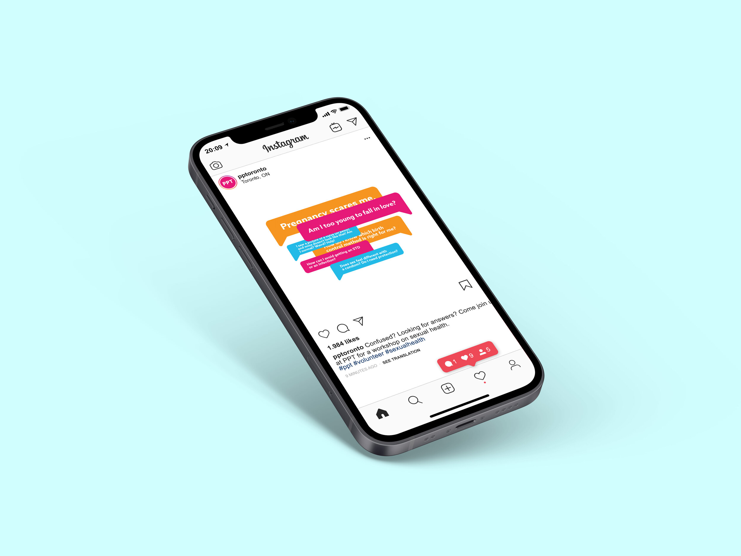
This student project explored a rebrand of Planned Parenthood Canada, with the goal of creating a visual identity that felt modern, approachable, accessible, and cohesive across different applications.
I began by reviewing the organization's existing visual identity and identifying areas where the branding could be made more consistent and easier to navigate. I then developed a new visual system and applied it across a range of print, digital, and environmental materials.
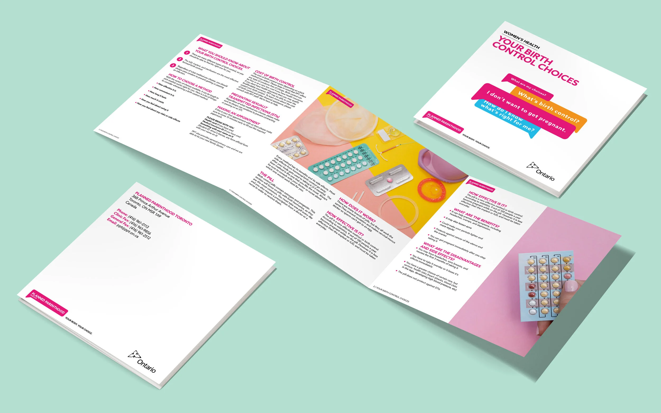
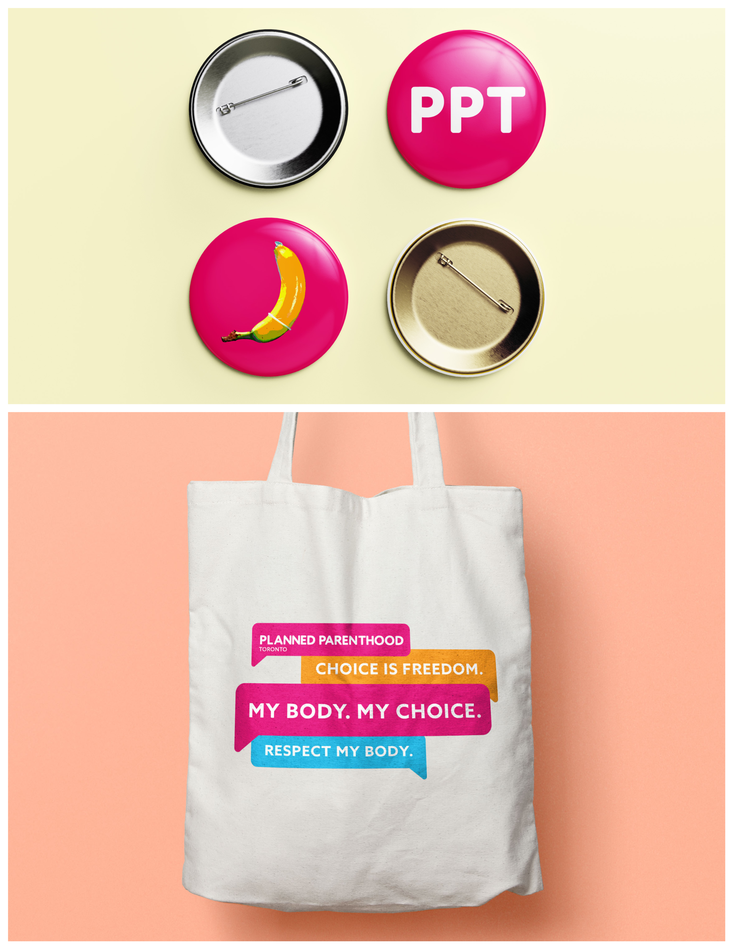
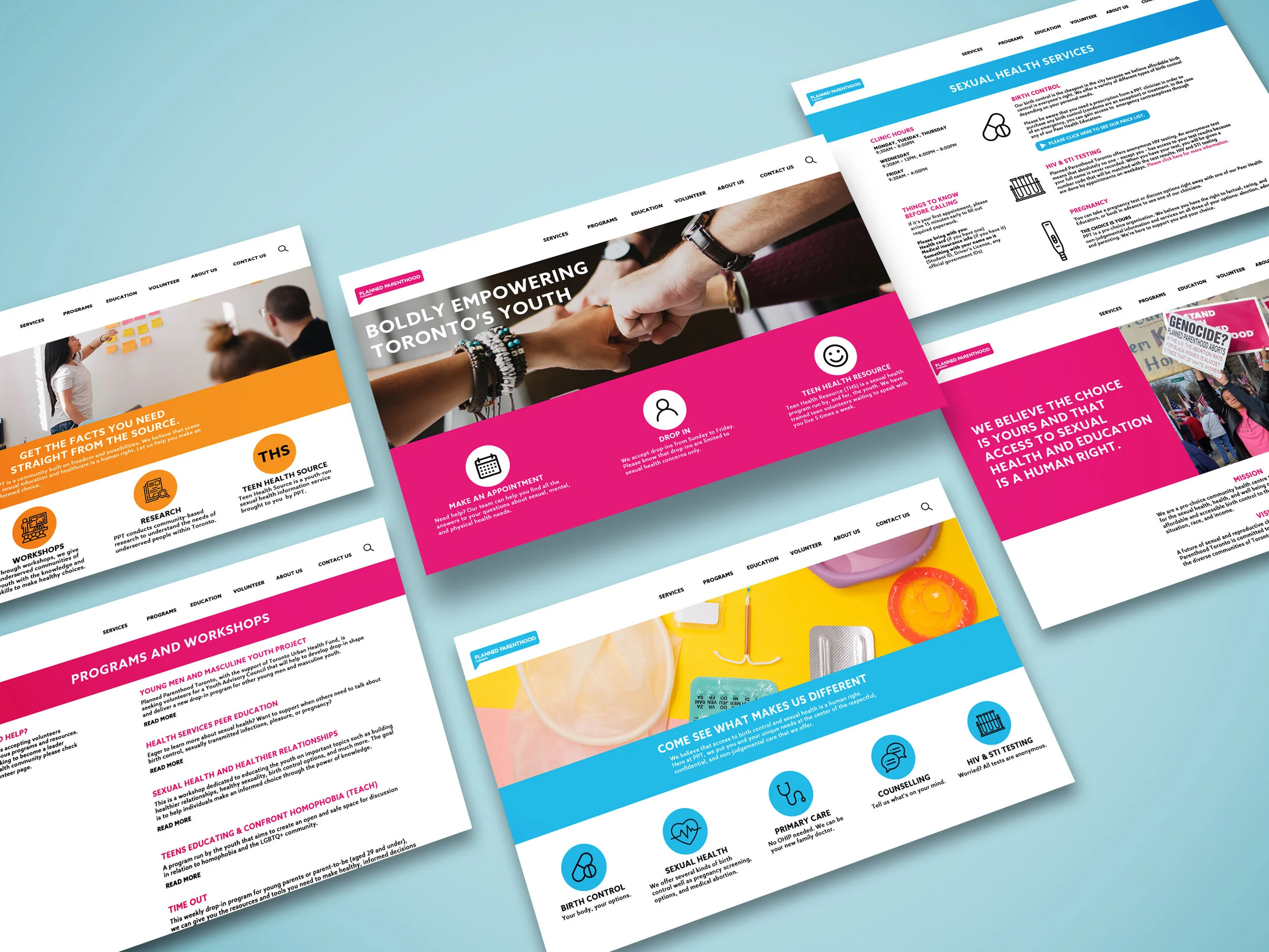
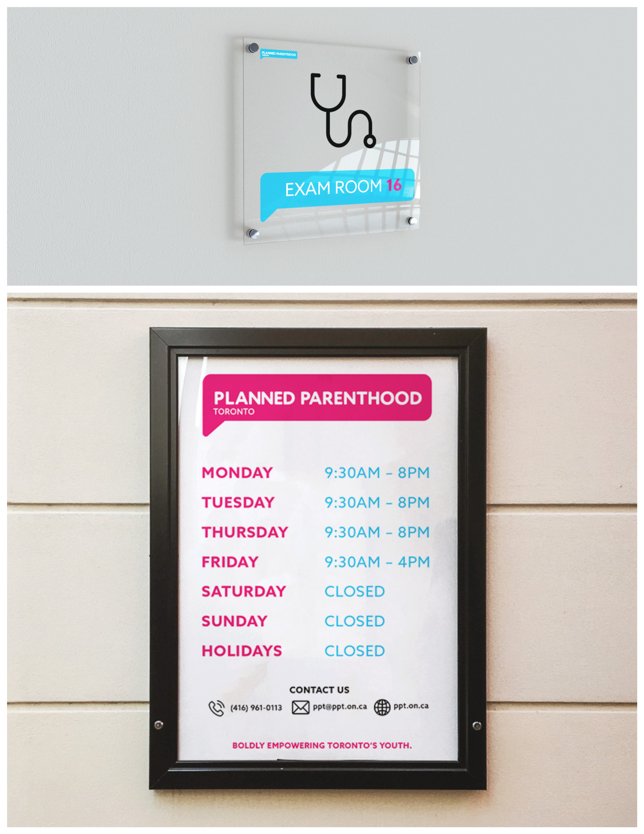
The rebrand included promotional materials, pamphlets, merchandise, signage, and a redesigned website interface. I used the same visual language across each application to create a more unified brand experience.
As part of the rebrand, I also explored how Planned Parenthood's advertising could be modernized to better appeal to a younger audience. I introduced a more contemporary visual approach across the campaign, using bolder typography, simplified graphics, and a more direct style of communication while keeping the overall identity consistent.
Role: Graphic Designer
Year: 2021
Programs used: InDesign, Illustrator, Figma, Photoshop